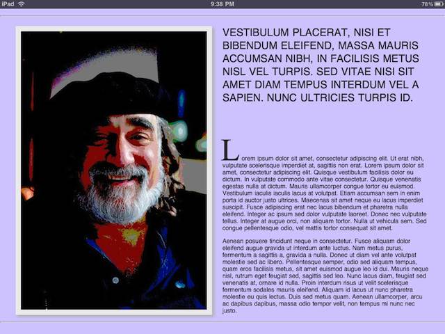
Add Orientation Support to Webpages
One of the best aspects of iPad usage is the ability to view and interact with the device in a myriad of settings; sitting, standing, even while reclined on the sofa. Naturally this means that people will often adjust the orientation of the device to suit their needs.
For example, an article that was begun to be read standing up with the iPad in portrait orientation could well be finished while sitting at a table, viewing the iPad rotated to landscape orientation. Naturally, good web designers will anticipate this and create and implement both horizontal and vertical layouts for each page of content.


However, pursuing this dual design strategy does not require you to create two physical files for each webpage, but can be easily accomplished through use of two special metatags added the webpage source, and the creation of two CSS files, one for landscape and one for vertical. In other words, you create one source document for the webpage, and then create two CSS documents to control how the page elements are placed based on the device orientation.
The Meta Tags
To add orientation support to your webpage, place the two link tags in the HEAD section of the HTML code. In the example below, the two CSS files used by the page are called portrait.css and landscape.css. Replace these with the paths to the two CSS files you will create for the page.
<link rel="stylesheet" media="all and (orientation:portrait)" href="portrait.css">
<link rel="stylesheet" media="all and (orientation:landscape)" href="landscape.css">
The linked stylesheets will automatically be recognized and used by the iPad, which will apply the appropriate stylesheet to the current webpage when the device is rotated.
Click or tap here to view an example page that supports both orientations. NOTE: If you are viewing the example page in a browser on a computer, rezise the browser window to make the orientation switch back and forth.
